
The graph above, taken from a new report from the Urban Institute, is a bit misleading. It doesn’t depict income quintiles or quartiles. It depicts income “classes”. “Rich” denotes families earning more than $350,000 per year; “upper middle class” denotes families earning from $100,000 to $350,000 per year; “middle” denotes families earning $50,000 to $100,000 per year; “lower middle” denotes families earning $30,000 to $50,000; and “poor” denotes families earning less than $30,000 per year. The number of families in each class varies.
The report does not control for geographical location. So, for example, despite being classified as “rich” a family that lives in Hawaii or Alexandria, Virginia with an income of $350,001 might actually have a pretty modest lifestyle.
Here’s the point: the real dichotomy isn’t between the top 1% and the bottom 99%. It’s between the “rich” and “upper middle class” and everybody else.
More than 29% of Americans are classified as “upper middle class” and here’s the report’s summary of who they are:
Finally,ongoing research will focus on the demographic characteristics of the growth of the upper middle class and rich by family status, education, and race/ethnicity. The upper middle class and rich in 2014 were composed predominantly of people who were married or cohabiting (82 percent in 2014 and 86 percent in 1979), who had a bachelor’s or graduate degree (30 percent in 1979 and 59 percent in 2014), and who were non-Hispanic whites (79 percent in 2014 and 93 percent in 1979).
and here’s mine. They’re mostly white, mostly older, mostly married, and mostly professionals, MBAs, business owners, or managers working for larger companies.
Also, a middle that encompasses a range of incomes from $30,000 to $350,000 a year and accounts for most Americans makes a hash of the idea of “middle”. I think that the Urban Institute needs to recalibrate its income classes.
Update
This map, er, sampled from a post at Fiscal Times, should show you what I mean by my comments above about controlling for geographical location:
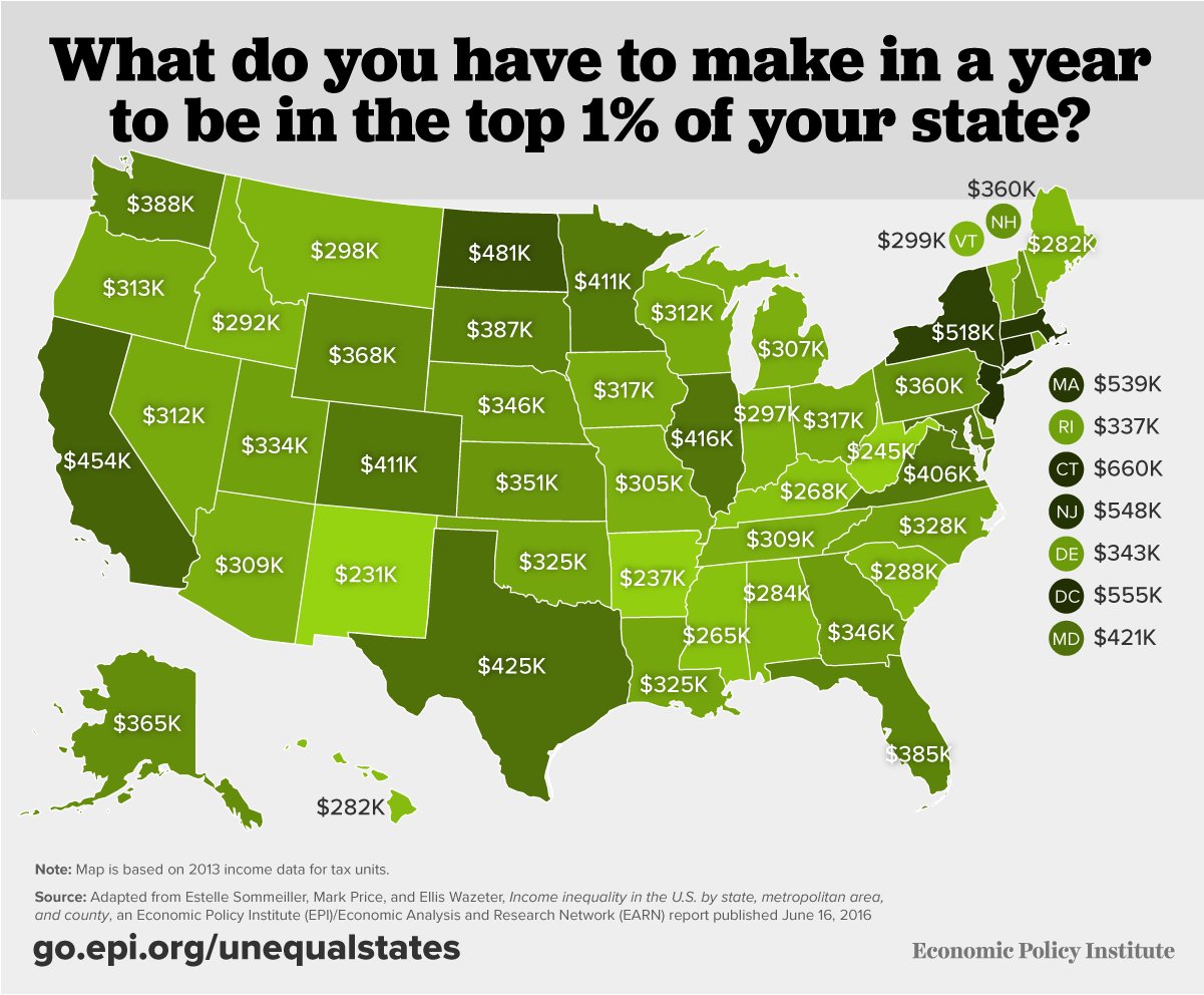
In some states, e.g. New York, $350,000 a year doesn’t even get you close to the top 1% of income earners. In others, e.g. New Mexico, Arkansas, it would put you a lot higher than that.


I think the wide middle class has to do with our obsession with the labels rich and poor. Personally, I’d say above $100k, the poor and the rest make the three relevant segments. (There are so few really rich people that the designation and all the supposed policy actions are really just politics).
The backgrounds and the trends should surprise no one who hasn’t been comatose. The presidential year politics are an object lesson. Hillary and her followers will maturbate over the notion of good they intend to do for the poor by harming the rich. Nothing will change.
The middle, lower middle, and low end of the upper middle concerned about falling down is Trumpville. If the nation falls broadly into recession, not just manufacturing, Trump probably wins. If not, Hillary wins………and then pulls the football away once again. Sad but true.
While I understand that the distribution of income in the United States is not normal (in the statistical sense), I think that assuming that it is is helpful in making distinctions of the sort the authors of the Urban Institute study are trying to make. In that case “rich” should be reserved for the top .5% of income earners (σ + 3) and “upper middle” for the top 4.5% (σ + 2) which I find makes intuitive sense. In dollars that’s about an annual income of $2 million and $100K per year, respectively.
Alex Tabbarok looks at this graph and concludes that the middle class is shrinking because many people are getting richer:
http://marginalrevolution.com/marginalrevolution/2016/06/the-middle-class-is-shrinking-because-many-people-are-getting-richer.html
I think when we look at the conventional quintiles, there is some truth to that, but the middle class is also shrinking because others are getting poorer. Instinctively, I think we would prefer a country with a more normal distribution.
Part of the issue though is costs, that’s what Dave’s geographic map indirectly addresses.
I don’t know that I have the facts to support this conjecture but my belief is that a lot of the change is due to government action and/or inaction. Something between 60% and 70% of all healthcare spending is government spending in one form or another. All of that is technically subsidy but I think that most of it is also subsidy in the sense that it would not be generated without government intervention.
And that’s just one industry. It’s an industry that accounts for more than a sixth of the economy but just one industry. Start totalling up the other sectors in which government is a major or even the only player and it starts to add up to real money.