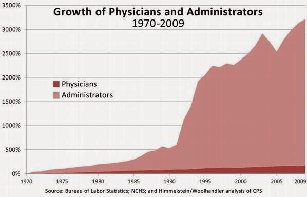
For the second graph, I would want raw numbers, rather than the very dubious %growth.
It’s easy to plot %growth from a near zero population and create amazingly terrifying graphs. Take a look at the graphs created by the antivaxxers that show the growth in autism cases.
!)- The first graph is visually misleading as the Y axis does not start at zero. It is essentially a doubling of the baseline number, but when you do not start zero it looks like a 400%-500% increase. By comparison the general population has grown about 50% and the over 65 age group By about 150% (from memory).
2) Probably true, but would be nice to see how they define administrators.
3) Underestimates costs. This is looking just (95% sure) at costs with the insurance product. People almost never factor in, especially the free market advocates, the costs incurred by providers.


Wow. Nothing I didn’t already know but very striking in degree.
I’d guess most healthcare analysis and think-pieces could be replaced with these three charts. Definitely bookmarking this post.
For the second graph, I would want raw numbers, rather than the very dubious %growth.
It’s easy to plot %growth from a near zero population and create amazingly terrifying graphs. Take a look at the graphs created by the antivaxxers that show the growth in autism cases.
!)- The first graph is visually misleading as the Y axis does not start at zero. It is essentially a doubling of the baseline number, but when you do not start zero it looks like a 400%-500% increase. By comparison the general population has grown about 50% and the over 65 age group By about 150% (from memory).
2) Probably true, but would be nice to see how they define administrators.
3) Underestimates costs. This is looking just (95% sure) at costs with the insurance product. People almost never factor in, especially the free market advocates, the costs incurred by providers.
Steve